SARA ABDULAZIZ
about
offerings
galleries
blog
book your consult
The idea for this pride-inspired wedding editorial came from our desire to plan a same-sex styled shoot. Same-sex marriage has been legal for seven years now, but there really aren’t many wedding editorials created around same-sex couples. With this shoot, we wanted to show that you can step outside the heteronormative box and still tell an absolutely gorgeous love story that can inspire gay and straight couples.

The Intimate Wedding Location
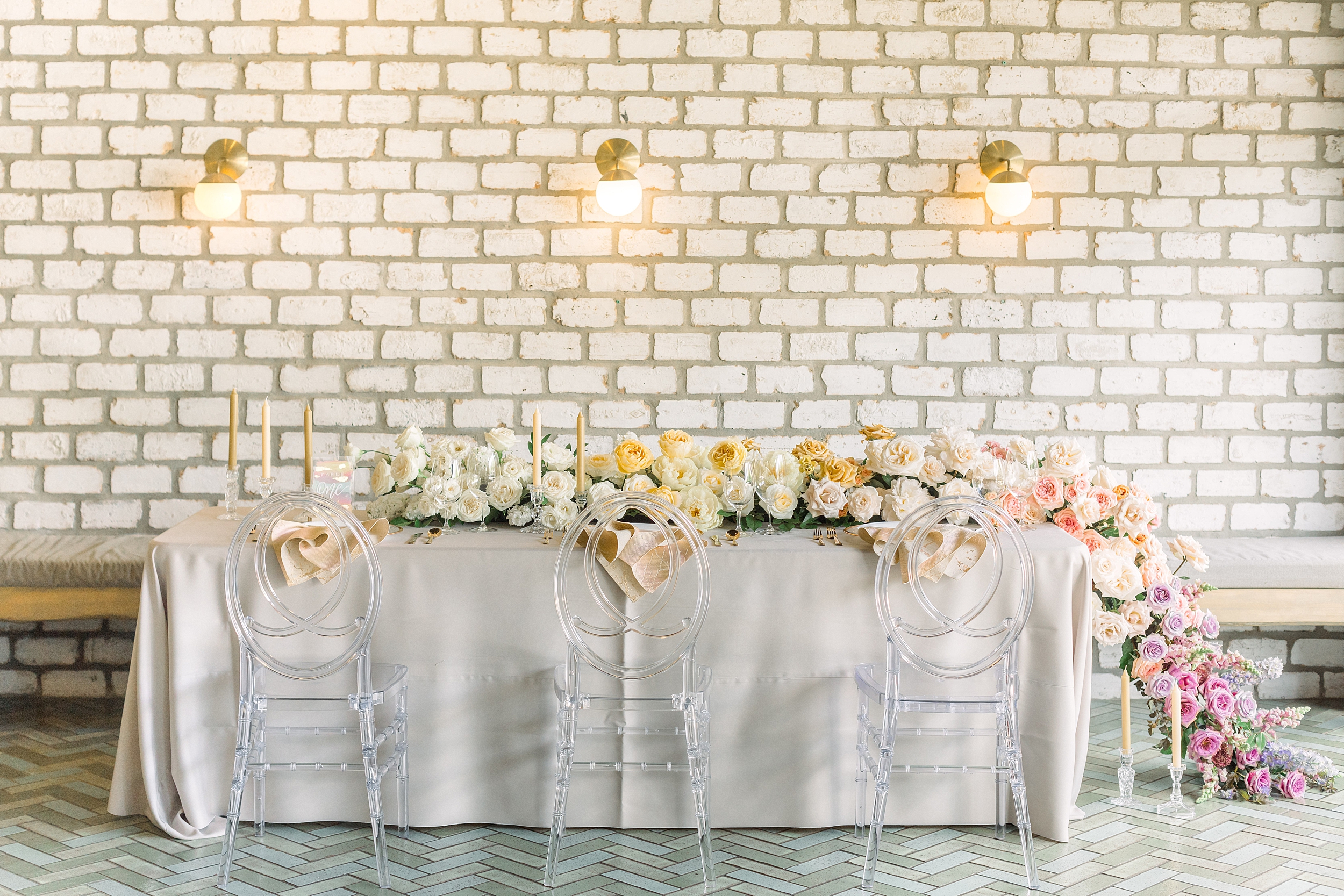
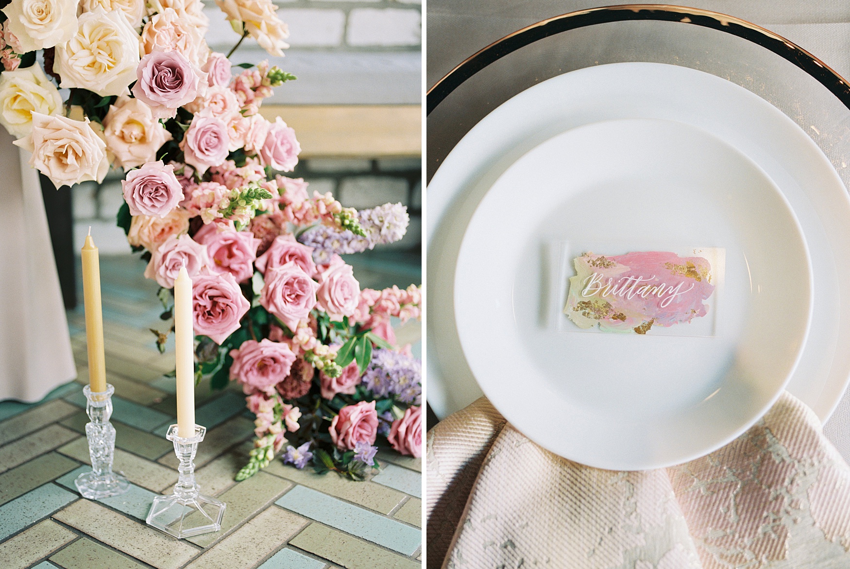
Our pride wedding editorial design inspiration started with the quirky style of Beckrew Wine Bar, a mix of modern, airy, geometric design elements and old-world charm in Houston’s vibrant Montrose neighborhood – the perfect venue for an intimate wedding celebration with a bright, welcoming vibe. We wanted every detail in this shoot to serve as a resource to inspire same-sex couples as they craft their very own “Pinterest-worthy” weddings, reinterpreting current trends like a split cake with overflowing florals and painted-back acrylic place cards in a pastel rainbow color palette. There are subtle nods to the rainbow throughout, accented by warm metallics, blush pinks, elegant neutrals, and modern clear acrylic.
The Paper Goods
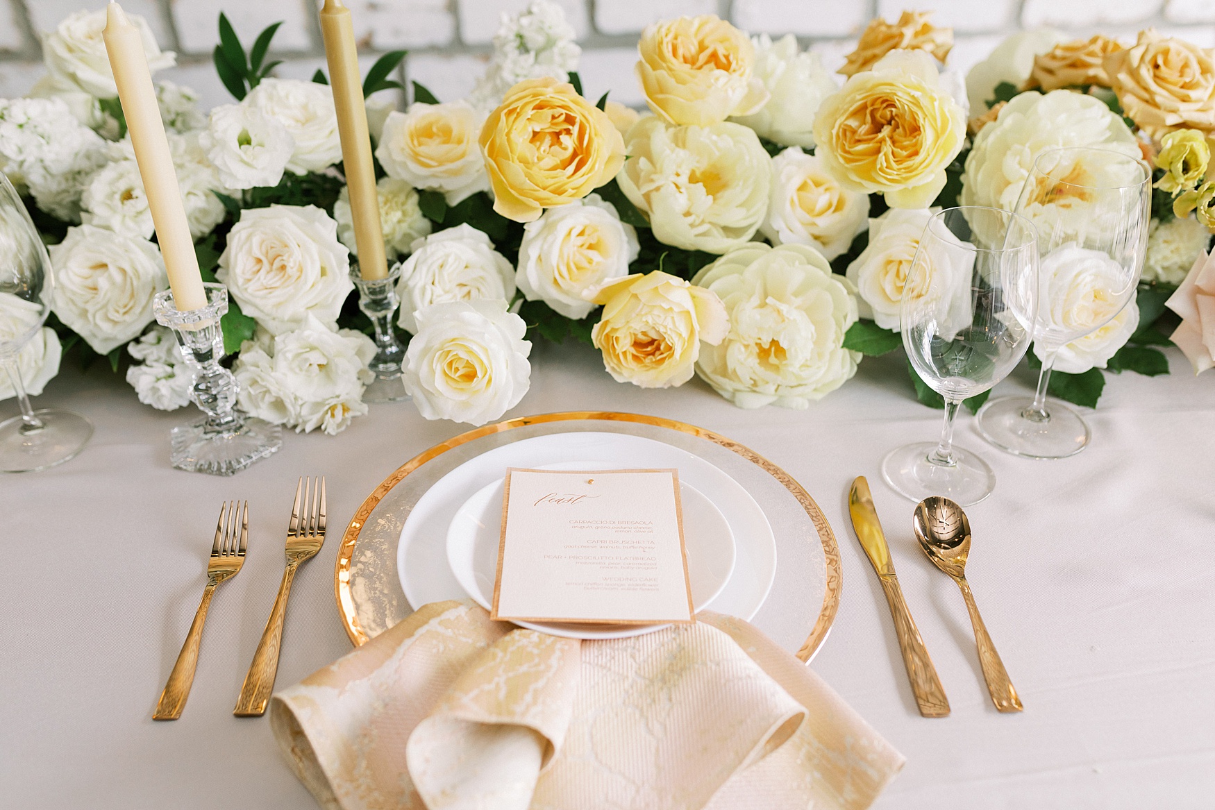
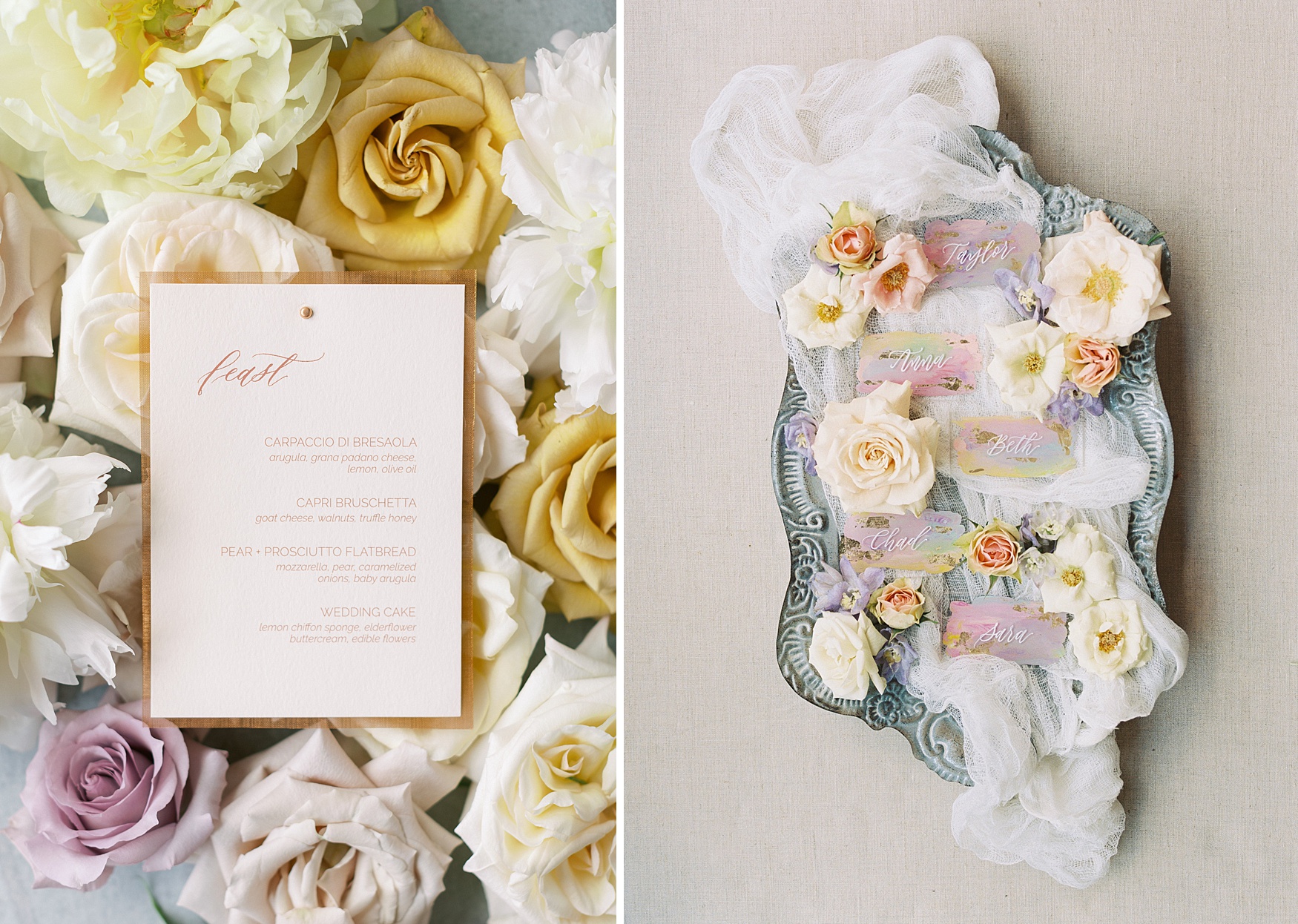
The wedding invitation suite created by Lindsey from Yellow Rose Calligraphy features hand-painted accents in a deconstructed rainbow palette. The pastel rainbow paint colors are carried through on the acrylic place cards and signage, with gold foil flakes added for a bit of extra drama. The blush menu she created is backed with real copper mesh, which is also used in the belly band for the invitation suite.

The Florals
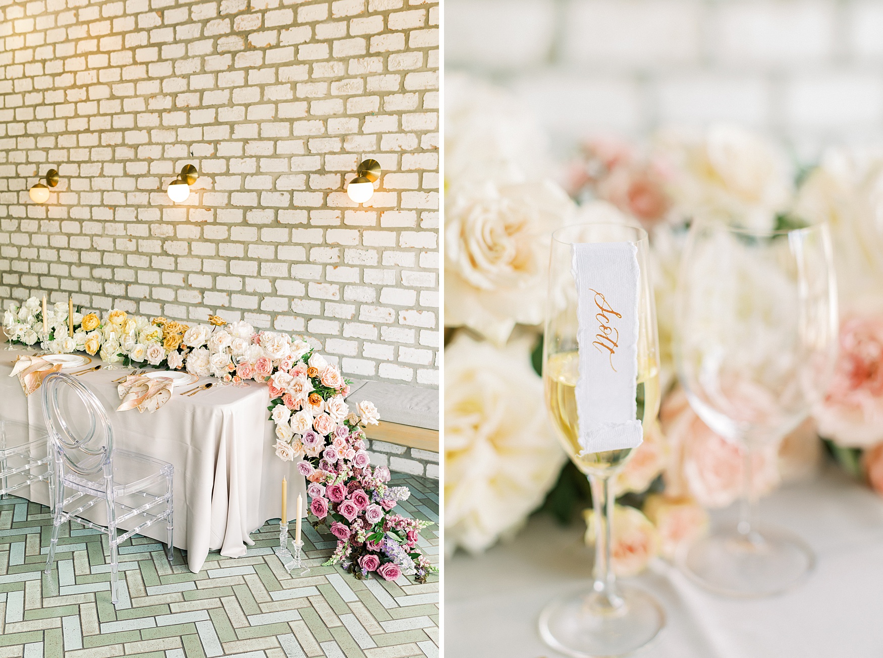
Chad from Flower Power Productions chose a gorgeous mix of seasonal blooms, including roses, peonies, lisianthus, tulips, snapdragons, delphinium, and sweet peas, blending different pastel rainbow hues to create a cascading, asymmetrical full-floral garland that is pure pride magic.

The Tablescape
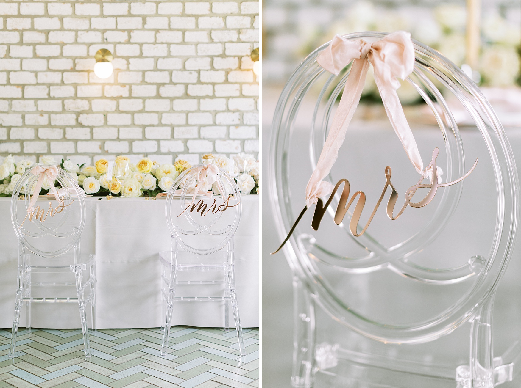
For the table design, we chose warm metallic tones in rose gold and copper to complement the colors in the flowers. Table linens from EB Inc. Events in a warm grey and sophisticated ombre metallic neutral napkins tie everything together. The ghost chairs bring in a touch of modern flair and act as the perfect backdrop for the rose gold mirrored acrylic “mrs” and “mrs” chair signs created by Laser Cut Co. from digitized hand-written calligraphy. Each plate was adorned with an acrylic place card with a pastel rainbow-painted back accented with gold foil flakes. We flanked the table with crystal candlesticks and taupe-colored tapers to complete the look.
For Your Sweet Tooth
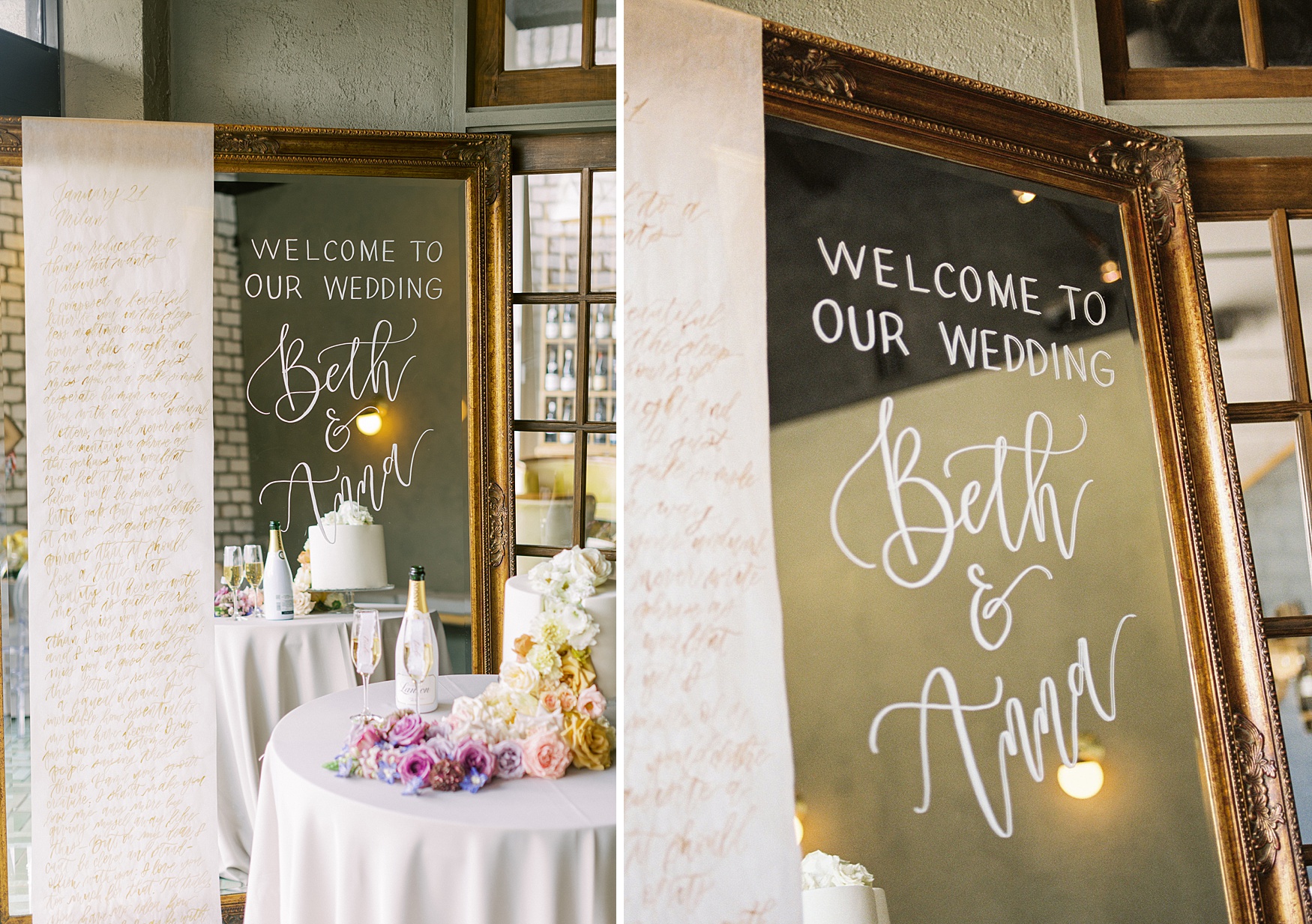
For the cake, Jesi of Dolce Designs created a split cake that served as the perfect canvas for a dramatic ombre floral arrangement overflowing from inside the cake onto the table in the same gorgeous pastel rainbow hues of the floral garland table runner.

The Signage
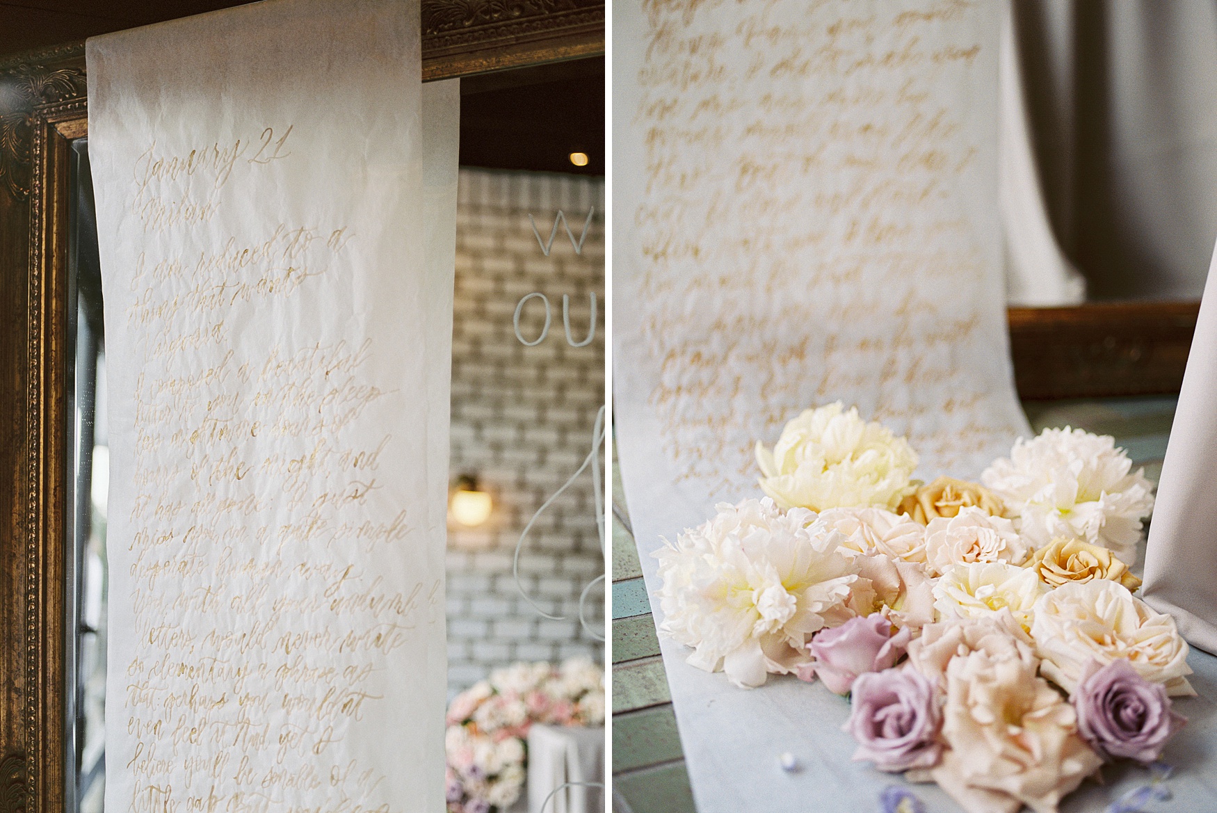
The calligrapher utilized the huge antique mirror already at the venue to create the welcome sign, and she hung a vellum scroll from the mirror brush-lettered in gold with the text of a steamy historical love letter written to novelist Virginia Woolf by her lover Vita Sackville-West in the early twentieth century.
Cheers!
No wedding is complete without a champagne toast, and Beckrew’s extensive offerings definitely don’t disappoint. Scrolled place cards on fluffy handmade paper for guests’ flutes mean everyone knows which glass to grab when it’s time for the toast, and our brides are ready to toast their forever with their matching “bride” scrolls.

A celebration of love with a touch of whimsy
This pride-inspired wedding editorial was really all about celebrating love and whimsical romance. Our goal was to integrate just the right amount of historical significance and elegant, vibrant details to create an artistic – yet entirely achievable – look for an actual wedding day.
The full text of Vita Sackville-West’s beautiful love letter to Virginia Woolf is displayed in calligraphy on the mirror:
“Milan
Thursday, January 21, 1926
I am reduced to a thing that wants Virginia. I
composed a beautiful letter to you in the sleepless nightmare hours of the night,
and it has all gone: I just miss you, in a quite simple desperate human way.
You, with all your un-dumb letters, would never write so elementary phrase as
that; perhaps you wouldn’t even feel it. And yet I believe you’ll be sensible
of a little gap. But you’d clothe it in so exquisite a phrase that it would
lose a little of its reality. Whereas with me it is quite stark: I miss you
even more than I could have believed; and I was prepared to miss you a good
deal. So this letter is just really a squeal of pain. It is incredible how
essential to me you have become. I suppose you are accustomed to people saying
these things. Damn you, spoilt creature; I shan’t make you love me any the more
by giving myself away like this—But oh my dear, I can’t be clever and
stand-offish with you: I love you too much for that. Too truly. You have no
idea how stand-offish I can be with people I don’t love. I have brought it to a
fine art. But you have broken down my defenses. And I don’t really resent it …
Please forgive me for writing such a miserable
letter.
V.”
Vendor Credit
Coordinator & Planner – Unveiled Bliss
Photographer – Sara Abdulaziz Photography
Florist – Flower Power Productions
Calligrapher – Yellow Rose Calligraphy
Rentals – EB Inc. Events
Laser Cutting – Laser Cut Co
Film Lab – Photovision
Cake – Dolce Designs
Ring Box – Mrs. Box
Venue – Beckrew Wine House – Closed
All vendors involved proudly serve the LGBTQ+ community.
Related
Specializing in Fine Art film & digital photography. Documenting romantic love stories and timeless, organic portraits locally & for destination weddings.
Based in Houston, Texas.
Join the SAP family to receive exclusive offers like our pop-up mini sessions!
View Menu
(Coming Soon!)
